A landing page is like the motor that drives your sales. It should be easy to understand, to the point, and aimed at getting people to do something. People have to want to remain right away because that’s the first thing they see when they click on your ad, banner, or email. Sometimes it’s on your main website, and other times it’s on a different page just for search engines or certain campaigns.
You could be asking yourself, “What is a landing page that gets a lot of people to sign up?” It’s one that you can use without thinking about it, and it makes sense right away. A landing page that gets a lot of people to sign up doesn’t give them too much information. Instead, it sends one clear message, tells you what to do, and keeps distractions to a minimum. The title, the button, and everything else work together to get people to click.
Marketers check the average conversion rate for landing pages to evaluate if their efforts are paying off. These stats tell you how your page stacks up against others in your field. What is the secret? Keep trying new things and getting better at them. A small change to the layout, language, or pictures can make a tremendous difference.
Your landing page can make or break your campaign in the end. A good one makes people click and buy things, which is good for your business. A bad one takes your money and doesn’t give you much in return.
Rules for Building a High-converting landing page
1. Don’t send ad traffic to your homepage.
Your homepage is often busy and full of links, menus, and options. Sending traffic from an ad there is like inviting someone to a party and then letting them wander around aimlessly. Instead, send visitors to a high converting landing page built for one clear purpose—getting them to take a specific action. This is the fastest way to turn casual visitors into real customers.
2. Make it clear and relevant.
People decide whether to stay on a page in just a few seconds. If they can’t find what they want or the page feels confusing, they leave.
A good high-converting landing page answers the questions visitors have in their heads:
- Will this give me what I need?
- Is there enough info to make a decision?
- Can I trust this site?
- How long will it take?
Every second counts. Use your page to guide visitors smoothly toward the action you want—signing up, buying, or subscribing. This is how landing pages that convert work.
3. Follow a structure that works.
Even though you can experiment, most best converting landing pages share a few key features:
- Start with a headline that shows the benefit.
The headline should match your ad. If the ad promised a “Breakthrough Meditation System,” your landing page headline should say the same. Visitors should instantly recognize the connection. - Keep the copy simple and clear.
Nobody wants to read walls of text. Use short sentences, bullet points, and the same words or phrases as your ad. This keeps your message consistent and easy to understand. - Focus on one action.
The page should guide visitors toward one goal, whether it’s signing up, making a purchase, or registering. Offering too many options spreads attention too thin and hurts conversions. - Remove distractions.
Cut out extra links, menus, or anything not related to your campaign. A clean page keeps visitors focused. - Make the form or button stand out.
The main action should be obvious. Big buttons, bright colors, and placing forms in multiple spots on a long page help users notice and act. - Stay on-brand.
Your high-converting landing page should look and feel like the rest of your website. Consistent colors, fonts, and style reinforce trust and recognition.
Tips for Creating the Perfect Landing Page
Before you sit down with a designer, grab a pen and paper and sketch your landing page. It’s much faster and less frustrating than trying to fix things later. Make sure your designer works with your actual copy, not lorem ipsum—so write your copy first.
Here’s a simple roadmap for how to create a high converting landing page:
- Identify your audience
- Decide the one action you want visitors to take
- Turn your solution into a clear, simple message
- Design the page with the essentials
- Put it all together and publish
Below, we’ll go through each step with tips and high converting landing page examples.
1. Identify your audience
A landing page works best when it speaks to a specific group of people. Understand their problems, what they want, and why they need your solution. Write as if you’re talking to one real person.
If you’re running multiple ads, consider creating multiple versions of your page. Headlines and copy should match each ad. This is a smart way to experiment with high converting landing page templates.

2. Decide the most important action (MWA)
Your MWA is the one thing visitors should do on your page. Every part of the page should guide them toward it.
- For expensive or complex products, start by collecting emails and nurturing visitors through email.
- For simpler or low-cost items, you can ask visitors to buy right away.
- For software or digital products, a free trial is often the best approach.
This step is key if you want to know how to build a high converting landing page effectively.
3. Craft a clear message
Now that you know your audience and the problem you’re solving, put it into simple, understandable words. Test a few versions to see which one resonates.
Keep in mind: clarity beats persuasion. This principle applies to any high converting product landing page or high converting webinar landing page.

4. Design the landing page
Once your MWA and message are clear, design the page around them. Here’s what matters:
Must-haves:
- Headline that speaks to your audience
- Company logo
- Quick explanation of your offer above the fold
- Longer explanation below the fold if your offer is complex
- Product or service image
- Simple form (1–3 fields, usually just email or name)
- Buy or sign-up button
- Privacy policy link in a pop-up
Avoid:
- Navigation menus and extra links
- Unrelated visuals
- Tiny, hard-to-read text
- Complicated forms with unnecessary fields
- “Click here” links—let users scroll naturally

Focus on high converting landing page design principles and keep it simple. Check high converting landing page examples for inspiration.
Copy length:
- Short copy works well for free or impulse offers.
- Longer copy helps with expensive or complex products, adding proof, testimonials, or explanations.
- Make it clear that visitors should scroll, and track how far they go.
5. Put it all together
Combine layout and copy, then publish the page. Use clear, descriptive URLs, like:
somesite.com/oil-rig-job-offers/
Keyword-rich URLs can improve click-through rates for search and paid campaigns.
6. Test and improve
Create at least two variations of your page. Test them, measure results, and refine. Continuous testing is how the best landing pages are optimized.
Following this guide on how to make a high converting landing page ensures your page is clear, focused, and ready to convert visitors into leads or customers.
And if you’ve ever wondered what is a high converting landing page, it’s simply a page designed with one clear goal, built to motivate people to take action, and structured to make that action as easy as possible.

Check out these helpful guides and tools on Aivix to achieve your goals.
Good Landing Page Designs And How To Use Their Best Features Are Shown Here
The best landing pages that receive a lot of conversions aren’t just gorgeous; they’re also made to grab people’s attention, make them intrigued, and get them to do something. They make it easy for individuals to get involved by using simple layouts, clear headlines, and graphics that capture the eye. These landing pages that convert make casual visitors into loyal customers by placing the visitor first and delivering them something of value right away.
Let’s look at some real-life examples and see how you can use what they did to improve your own landing page.
Spotify
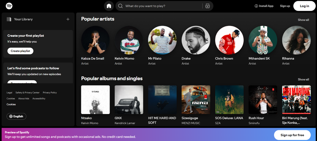
What works nicely on the home page of Spotify:
- Clear value proposition: Spotify makes it clear to visitors right immediately what they get: a huge library of music, podcasts, and personalized suggestions. The message is concise, simple, and gets straight to the point.
- Easy call to action (CTA): Buttons like “Sign up for free” make consumers want to do something right away.
- User-centered design: The layout is basic and clear, and the images are attractive and easy to find your way about. Everything on a landing page that works well should be easy to use.
How to put these concepts:
- Show how much you are worth
Make a title that speaks directly to your audience and makes it apparent what the value is. Add a subheading that clearly lists the main benefits. “Make your first playlist,” for instance, or ‘It’s simple; we’ll show you how.” This level of clarity is what makes any design for a landing page work. - Make your call to action stand out
Use buttons that are big, have a lot of contrast, and have clear language that tells consumers what to do, like “Sign up free” or “Start listening.” Put them above the fold and have them repeat as they scroll down. It can also work well to have buttons that stick and stay visible. These are features that are common on landing pages that get a lot of people to sign up. - Keep the design simple and easy to use
Make the layout basic so that people can read and use it easily. Use high-quality pictures to show how your product works. Break up your information into portions with text, photos, and empty space to keep things from getting too busy. For instance, Spotify makes it easy to see how the service works by showing playlists and music players. This is the easiest way to encourage people to join up for a page.
Airbnb
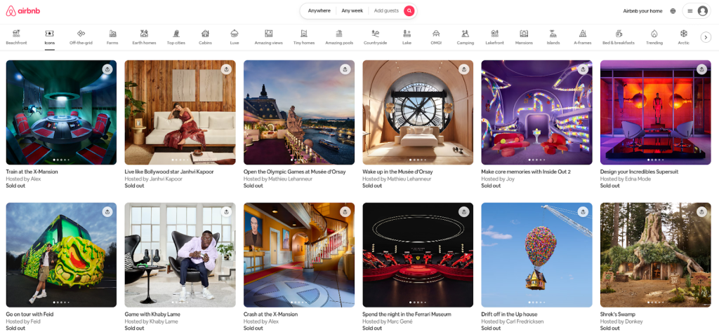
There are several great aspects about the Airbnb homepage:
- Strong hero area: The hero section at the top of Airbnb’s page is easy to see right away because it isn’t too cluttered. Airbnb is fantastic since it provides a lot of different places to stay that are cheap and offer unique experiences. You can see this in the clear messages and high-quality photographs. Visitors can easily observe how useful the platform is.
- Easy to use: The search box is easy to discover and use, so customers can quickly limit down their options based on what they want. It’s easy to get around, so guests can quickly find what they need without getting angry.
- Personalization: Airbnb modifies the content based on where the user is or what they have done in the past. The experience becomes more personal and engaging when you get suggestions for places to stay, local tips, and deals that are suitable for you.
How to utilize these ideas on your own page:
- Create a unique hero section.
Use photographs that are intriguing, related to your topic, and easy for your audience to relate to. Put a short headline that shows off your main value and a short statement that backs it up by saying what makes you different, like low prices, a wide range of products, or anything else. - Make it easy to get around and see.
Show users around your page. Add a big search bar or main feature area, and use filters, categories, or dropdown menus to make it easier for clients to find what they need. People are less likely to get angry and more likely to stay interested when they can browse without any problems. - Make the event unique.
Use cookies or geolocation to show each visitor things that are relevant to them, including local recommendations, things they’ve looked at recently, or special deals. Your page will be more exciting and welcoming if it has interactive features that alter depending on how people use it.
Wix
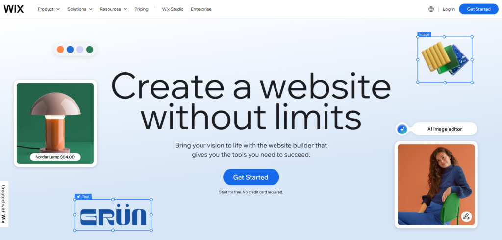
Why Wix’s landing page is so good
- Design that is easy to use. Wix’s landing page works so well because it doesn’t try to accomplish too much. The arrangement has a lot of room and is neat and tidy. The objective of each portion is to get the reader to focus on the main message and, in the end, the “Start your risk-free trial” button. It’s easy to understand and fun to use because there aren’t any other things on the website that get in the way.
- Messages that are easy to understand and pleasant to read. The title grabs your attention right away, and the subheadline tells you just enough about Wix and why you should give it a try. They work together to produce an introduction that is clear, confident, and convincing, and that makes people want to learn more.
- Tells a tale with pictures. Wix doesn’t only give visitors a lot of text; it also shows them what it can achieve. The graphics—real templates, example designs, and pictures of tools in use—tell the tale on their own. People can tell right away how valuable the platform is, which makes it easy and natural to use.
How to put these ideas to use on your own page
- Keep things simple and clear. There should only be one goal for your page. Make sure your message gets across by using a clear structure, lots of space, and a clear visual flow. Above the fold, make sure the title, main benefits, and call to action are all clear to view.
Make the main button a bright color that stands out on the webpage. Don’t put too many links, icons, or paragraphs on the page. Anything could be a distraction that makes it harder for customers to buy. - Write headlines that people can connect with. A good headline should quickly make it clear how much your offer is worth. Be nice and keep it short. Talk about what the visitor will get instead of just what you’re selling. Next, write a subheadline that goes into more detail on how your product or service does what it says it will do.
You may test out different headlines and subheadlines with A/B testing. A small change in the words can frequently make a huge difference in how people respond. - Use pictures for a reason. Choose real, high-quality photographs or graphics that match the style of your business and show off the greatest elements of your products. Use your color palette intelligently and consistently to highlight key things, like your call to action.
Adding brief demo videos, small animations, or hover effects can make the experience more fun. Don’t forget about the people who talk on the phone. A page that looks great and loads swiftly on all devices will always leave a better impression.
ExpressVPN
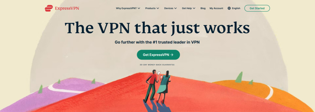
Why the landing page for ExpressVPN works so well
- A title that makes people trust you right away. The simple phrase “The VPN that just works” at the top sets the tone. It doesn’t try too hard; it merely lets visitors know that this is a trustworthy provider that keeps its promises. This kind of clarity is refreshing in a field full of arcane tech terms. It talks about what most people want: something that keeps their privacy safe without being hard to use.
- Deals that get people to do things. ExpressVPN understands how to give people a little push. Users feel like they’ve found something exceptional when they see offers like “Get extra months free” on the site. There is a faint sense of urgency to it, as if you might miss out if you wait too long. It’s a basic trick, yet it works because it feels authentic and not contrived.
- Have faith that is clear to see. The 30-day money-back guarantee and the phrase “Go further with the trusted leader in VPN” are just two examples of how everything on the page is meant to make users feel confident using ExpressVPN. When you add in reviews from real users, that feeling of trust only gets greater. It’s not so much about hard selling as it is about showcasing that other people use the service every day.
How to put these ideas to work on your own page
- Begin with a headline that makes sense.
Talk about what is really important to your audience. Write a brief, clear statement that tells them what you do and how it helps. No fluff or filler. Make it easy to see and understand, so it’s the first thing customers see when they get to your page.
- Make it seem like you need it right away.
If you’re making an offer, make it seem like a real chance instead of a trick. If you want them to act now, make it obvious what the offer is, whether it’s a discount, a free add-on, or a limited-time bonus. A small visual indication, like a timer or a prominent banner, can help people make choices.
- Let proof speak for itself.
People believe people more than promises. Include some real reviews, logos from well-known partners, or even a quick statement from a delighted customer. If you add a clear money-back or free-trial policy, you take the pressure off. People are more inclined to take the following step if they feel comfortable.
Last Thoughts
Your landing page is more than just a digital storefront; it’s the most important part of your marketing plan. Every click, headline, and call to action is a chance to get someone to sign up. The principle is simple: whether you’re starting from scratch or making what you already have better, make it easy for people to say “yes.” Make sure your message is clear, your design is on point, and your offer is too fantastic to pass up.
Now it’s your job to use what you’ve learned to design landing pages that not only look amazing but actually work. The sooner you start, the sooner you’ll see benefits. So go ahead and construct your landing page now. More people will sign up.
FAQ
What kind of landing page leads a lot of people to take action?
A good landing page has one clear goal: to get people to do something, like sign up, buy something, or ask for more information. The content of the page all points to that aim. It does what people expect after clicking on an ad, makes the value evident, and keeps the key call-to-action in front of them. The best pages are those that are easy to read and feel right. A conversion rate in the double digits is good.
What are the most critical aspects of a landing page that get a lot of people to sign up?
Every landing page that works properly needs a few things:
● A clear, direct headline that promises value.
● A clear call to action right away.
● Images that make the message clearer instead of being difficult to understand.
● Real proof comes from reviews, testimonials, or trust badges.
● A concise, easy-to-fill-out form that doesn’t ask for too much.
● A design that looks good on mobile devices.
● A quick load time so that people don’t leave.
What do you do to develop a landing page that attracts a lot of people to buy?
To start, find out what your audience wants the most. Give one thing, not five. Write a short headline that focuses on the benefits and has a clear call to action. Use trademarks or reviews as social evidence, keep your design simple, and make small changes over time, such as the color of buttons, the length of forms, or the language of headlines. Use analytics to see how people use your site and then continuously make it better.
What is a good conversion rate for landing pages that actually work?
There isn’t one number that works for everyone, but most landing pages that do well get between five and ten clicks. If they already know you, they will probably come. For cold traffic, 5–8% can be good, but it all depends on how well you know your visitors.
How can I make my landing page work better?
If your landing page isn’t working, it can be because it has too much information, a bad title, or a call to action (CTA) that is hard to locate. The ad’s message and what they saw don’t always match up. Make things easier. Make sure your main button is easy to find, tighten up your writing, add proof like real reviews, and check how long it takes for your pages to load. Pages that load slowly quickly lower conversions.
Should the CTA be above the fold on a landing page that attracts a lot of people to sign up?
Yes. People should be able to view your main button or form right away. You can say it again later on the site, but the first one should be at the top. On smartphones, a sticky CTA bar performs better because buyers don’t have to scroll to act.
How many fields should a landing page for getting leads have to get a lot of leads?
It’s best to keep it short and only ask for one to three fields. Only ask for what you genuinely need. If you want more information later, use follow-up questionnaires or surveys. People are more likely to push “submit” if they don’t feel any resistance.
Do videos really help a landing page that receives a lot of clicks?
Yes, but only if you do it well. Others are more inclined to trust and do business with you if you develop a short, honest video that shows how your product works or what it helps others do. Make the video short (under a minute), include captions, and make sure it doesn’t slow down your page or cover up your CTA.
What makes a landing page for an e-commerce site that sells a lot of stuff different from a website for a SaaS product?
A strong e-commerce landing page contains fantastic photographs, prices, and reviews that make it easy for consumers to look around. The major point of a SaaS page is to show how the service saves time or money. It frequently offers demos or free trials. Both need to be clear, give proof, and have one obvious next step that makes visitors want to do something.
Reviews
1. After years of tinkering now i know how to build a high converting landing page without guesswork. We tightened message match from ad to headline, put the CTA above the fold, trimmed the form to two fields, and added real customer quotes. Our landing page conversion rate jumped from ~3% to just over 7% within two weeks. It’s rare to find advice on landing pages that convert that’s this actionable.
2. We rewrote the headline around the value, added a short demo video, and clarified the pricing block. To create a high converting landing page, do it, the new page halved our CPA and doubled trial sign-ups.


0 Comments